Answer The Public
AnswerThePublic works with businesses to provide search insight information dependant on their key words and phrases.
They were seeking a new visual identity - one that truly represented the people that built it - complimenting the voice of their brand.
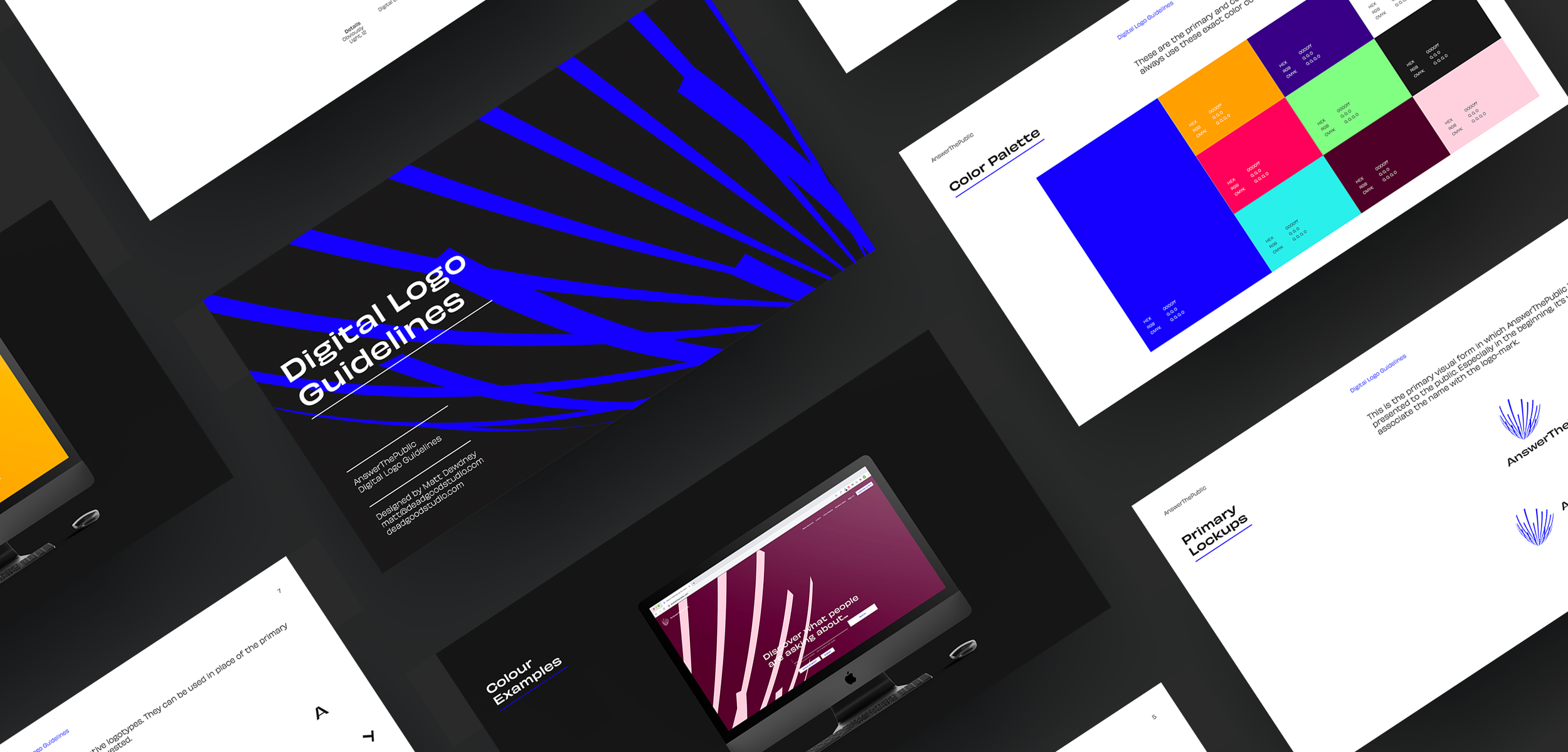
Representing the platform’s core function, the identity was designed using organic shapes alongside gentle movement to visually reflect the process.
ATP is focused on organic search. The look and feel needed to feel as technical as the product & service, but that ultimately - it’s focused on an organic journey dictated by the users.
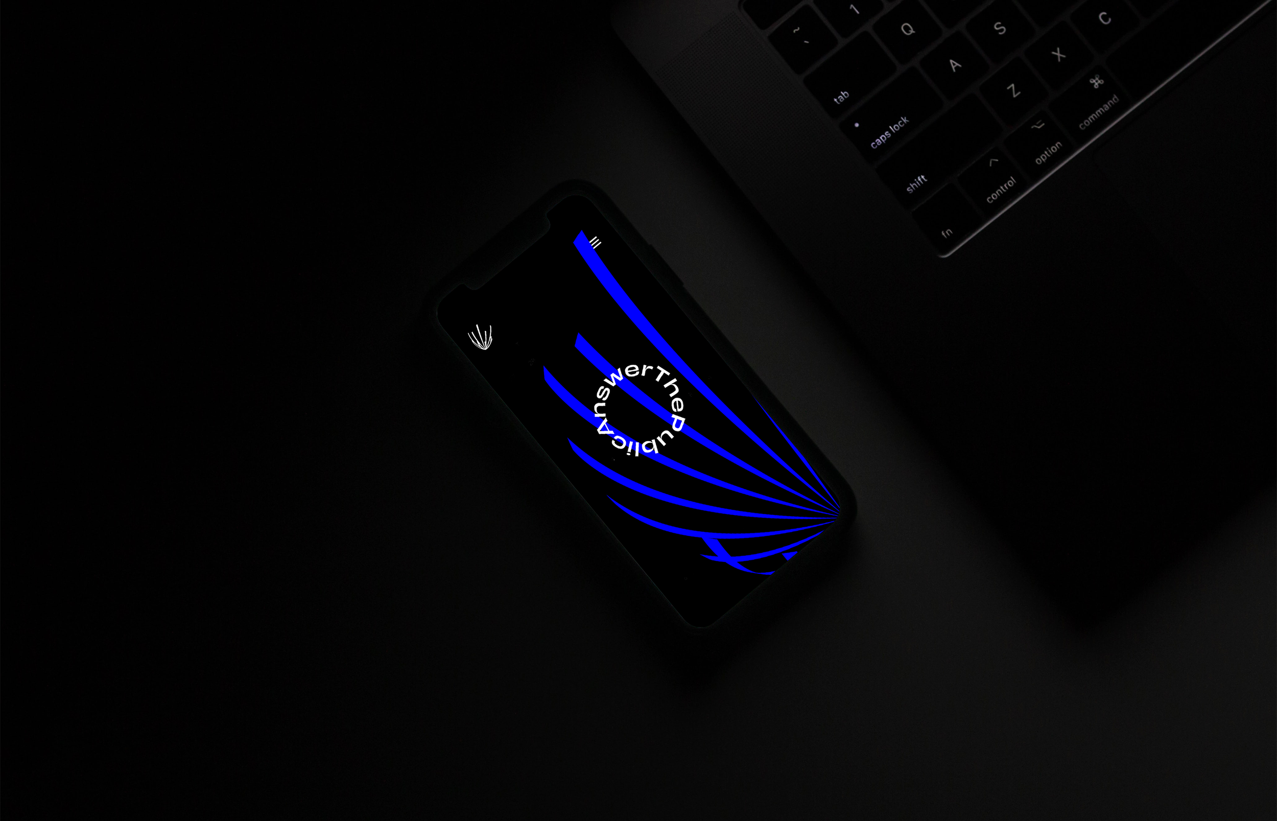
Utilising a highly contrasted colour palette rooted ATP as a digital first environment, but through use of the fluid curves of the visual asset, and dynamic logos, we used soft curves to remind the user on a more subconscious level, that the data was all sourced from organic search.

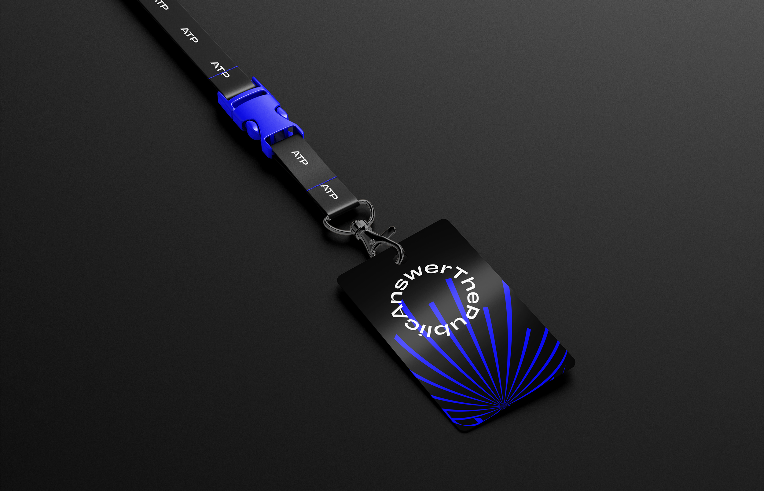
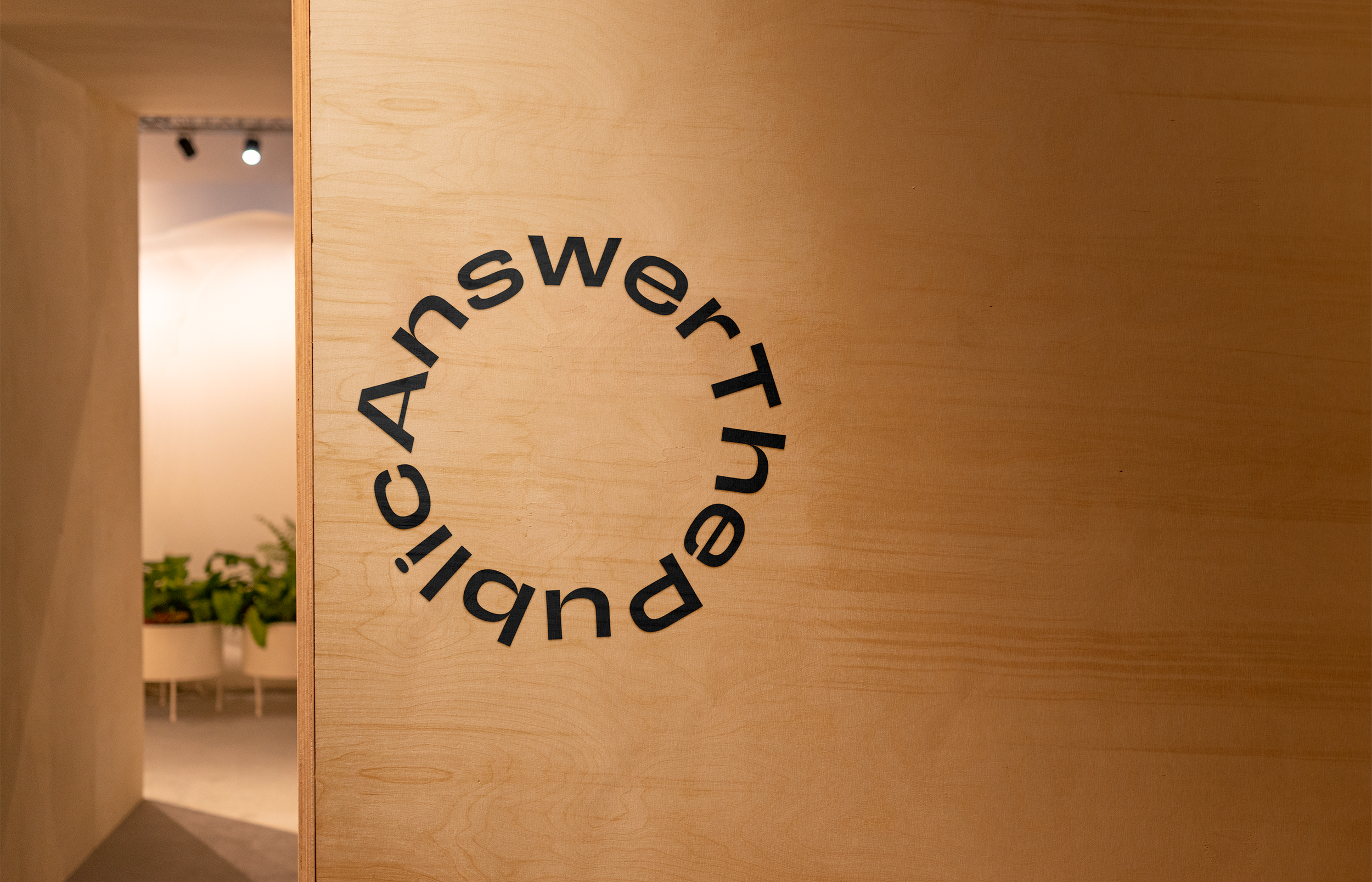
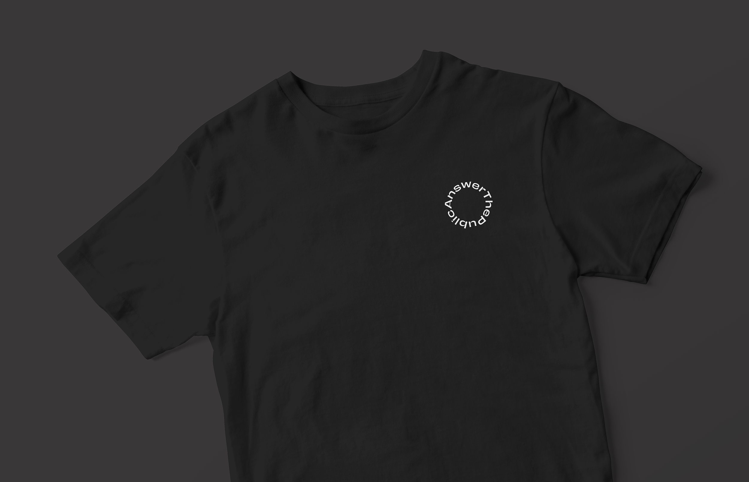
With the search service orientating around refining results and focusing on one powerful key word or phrase, pairing the organic structure with a rosette wordmarque created a bullseye on the concept of the search. Visually expressing this concept around targeting key results.
When interacting with the brand, users and investors would often find themselves directly communicating with the founders.
We needed to ensure that the identity also reflected the personality of the founders, as they were such key roles in the business development. To do this, we used we used a bold, punchy typeface that injected an element of play and humanity.
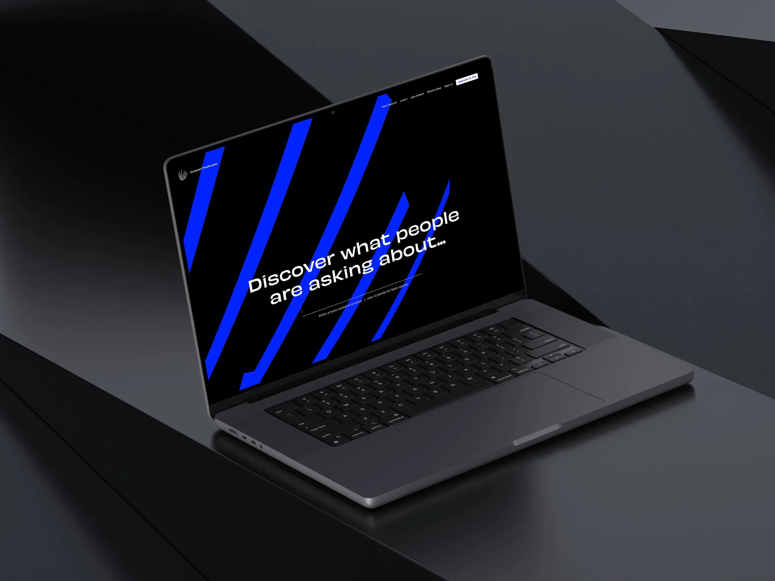


The look and feel for the website captured a sense of humour through a bold, playful typeface.
Working closely with the team at AnswerThePublic, I crafted an organic but tech-focused brand identity, coupled with a logotype that was full of character and completely unique, just like the team at ATP.
Project Overview
Logo Design
Marketing Collateral Design
Visual Identity
Brand Guidelines